
The goal of your banner is for it to be clicked! To achieve this goal, use your points of differentiation to build your message: what is your competitive advantage? What do you have more to offer? A discount, an innovation, a service? If you have a sales proposition, shine a light on the unique benefit of your offer. You can go further by announcing a special offer to draw attention, such as “50% discount” or “limited time offer”.
The shorter and quicker to the point, the better! It is easier for your recipient to understand. For example, Buying, renting? You’ll find it here! It can resemble a slogan and it doesn’t take long to read, and most of all, it leaves a lasting impression on your recipients.
Most importantly, communication should be adapted to your audience. You should always have the following in mind:
The message should be the first thing that catches the recipient’s eye and should take up most of the space of the banner.

Not too big, not too high! Email signatures should not look like mass emails. The max recommended dimensions for your banner should be 600 x 200 px.Choose relevant images and illustrations that reinforce your message.The text should be readable. If you use a background/dark image, use a font style that is clearer.
The most fundamental aspect of your banner: the call-to-action! Once again, go for a clear statement and an easy-to-grasp customer benefit. What is key is the number of clicks. For example: Become a homeowner: at this price, we are moving in!
The button should look like a button, an element the recipient can click on. To support the active form of the CTA, you can have a more dynamic shape than a simple rectangle and/or icon that make the recipient want to click.
There is no “best color” for the button. However, according to a few comparative studies, we remark that the winning looks rely on one principle: the contrast. What counts is not a red or green (or even neon) CTA, but that it is different than its direct environment and that it can be distinguished more easily.
When adding a text to the CTA, try to choose a color that is readable (no white on a light color). Choose the right location: the eye naturally goes to the right, but it can also be visible if placed on the left. And since your CTA is the most important element that your recipients should not miss.It should be big!
A few examples: “Learn more”, “Watch the video”, “Register to the webinar”, “Click here”, “Download the app”, “Free trial”, “Take the survey”, “Buy”. The use cases for email signatures are endless!

It is not rare to find banners that redirect recipients to a homepage. Error! For the best conversion, direct your traffic towards an appropriate page, such as a dedicated landing page. The page should relay a promoted offer but also an offer with a similar visual to the one in the banner. To create it, determine your goals and optimize your contact form and URL. The CTA should direct the recipient to exactly where you wish to have them.
Despite all the advice presented to you, do you lack ideas or time? Our teams are here to help you!

Yes, with the 'Campaigns' offer, it is possible to track the number of clicks on the email signatures of all your employees in the 'Statistics' area of the platform.
You can then access a detailed or global view of the number of clicks on the email signatures of each employee. You can use the search option to target a specific signature or a given period. Finally, you have the possibility to export all statistics to an Excel document.
If you launch campaigns with banners inserted in your email signatures, you can also access their performance via this same space.
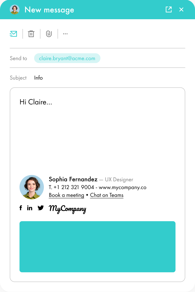
With Letsignit, you can easily add social network icons in your collaborators' email signatures and link to your company pages. Also, our "attributes" feature allows you to manage personalized URLs for each of your collaborators such as their individual LinkedIn profile.
And that's not all: you can add links to an appointment-setting application, allow your customers to leave reviews easily, and integrate our 'Chat on Teams' widget to let anyone start a discussion via Microsoft Teams chat.
It’s up to you! As an administrator of the Letsignit platform, you choose whether or not to grant modification rights to your employees. These permissions are managed on an attribute-by-attribute basis, which means that you can decide to allow the employee to change their phone number, but not the address of your premises, for example.
This feature applies to all attributes in your directory, including custom attributes created on Letsignit. When your employees change one or more attributes, your directory is obviously not affected.
It often happens that employees make their email signature their own: custom format, bad fonts, colors inconsistent with the brand standards... all of this has an impact on your brand!
A consistent visual identity is considered authentic and outperforms a perceived weak one by 20%. And, your customers are 2.4 times more likely to buy your products.
With Letsignit, take back control over your brand identity by standardizing all your email signatures. Our tool has many features that allow you to customize your signatures by department, by audience or by subsidiary. Not to mention the possibility of carrying out campaigns within your email signatures thanks to our Campaign offer.
What is the user experience like for our employees?
In both cases:
In short, they have autonomy in their email signature, but you keep control on the field, signatures, and banners they can edit or use.
With our "multi-signature" feature, your employees can benefit from multiple email signatures. No technical manipulation is required. Thanks to our Add-in for Outlook or the desktop app, they can change their email signatures as they wish with just a few clicks.
Regarding the creation of email signatures, you can make several variations such as:
Everything has been thought of to go further in the personalization process based on the recipient of your emails.
If sending emails has an impact, non-optimized email signatures also have an impact. An unsuitable format or an image that is too heavy considerably increases the size of your signatures... and therefore, your emails.
As a responsible economic actor, we contribute to reducing our CO2 emissions and those of our customers in several ways:
As we are increasingly involved in sustainability initiatives, our priority in 2023 is to develop even more green IT functionality.


Lorem ipsum dolor sit amet, consectetur adipiscing elit, sed do eiusmod tempor incididunt ut labore et dolore magna aliqua. Ut enim ad minim veniam, quis nostrud exercitation ullamco laboris nisi ut aliquip ex ea commodo consequat. Duis aute irure dolor in reprehenderit in voluptate velit esse cillum dolore eu fugiat nulla pariatur.


