.svg)


Logo, colors, typography, imagery... All these visual elements tell people who you are at a glance, create a distinctive impression, and build an emotional connection based on your identity rather than simply on what you sell.
But how do you build a cohesive visual identity that genuinely reflects who you are? This article explores the essential components of a strong visual identity, provides step-by-step design tips, and shares inspiring examples to help you build a powerful and memorable brand.
Honestly, who remembers much from their high school biology classes?
Yet we probably all learned a few fundamental concepts, including genotype and phenotype. Essentially, the genotype is an organism's identity — its DNA — while the phenotype is the observable expression of that identity.
If we apply the same analogy to business, visual identity could be described as a brand's phenotype: the visible expression of its DNA.
Far more than surface-level aesthetics or simply making things look good, visual identity is the graphic translation of what a brand stands for: its core values, strategic positioning, culture, and the specific audience it wants to attract and retain.
It brings together the signs, shapes, colors, and typefaces that allow an organization to be recognized at a glance, acting as a kind of visual "passport" that becomes inseparable from its name.
A visual identity should appear across every touchpoint, turning every communication channel into an opportunity for instant recognition. In other words, it is the face you present to the world — a sensory and psychological signature designed to stay in people's minds.
These three terms are often used interchangeably in marketing conversations. However, they describe distinct concepts that are worth understanding if you want to manage your brand strategy effectively.
Brand identity is the strategic and conceptual foundation of your business. It represents what the organization is and what it deliberately wants to project. It encompasses intangible but fundamental elements such as your mission, vision, values, customer promise, tone of voice, and personality.
In other words, brand identity defines the "who" and the "why" before you start thinking about the "how."
Visual identity, sometimes referred to as a graphic identity, is the visual expression of your brand identity. It translates that identity into design and tangible elements that people can see: your logo, color palette, typography, recurring graphic elements, and visual style.
Its primary purpose is to make your company's DNA visible and immediately recognizable across every communication channel. If brand identity is the soul of the company, visual identity is its face — creating the visual consistency needed to stand out in a crowded marketplace.
Finally, brand image relates to perception and reception. Unlike the two concepts above, which are directly shaped by the company, brand image is the result of how the public actually perceives the brand.
It encompasses the mental associations, feelings, and judgments consumers attach to a brand. In other words, if identity is what you claim to be, brand image is what people think and say about you once you've left the room.
The cornerstone of your visual system, your logo is often the most immediate symbol people associate with your brand.
Its job is a tricky one: it needs to convey something about the complexity of your business at a glance while remaining simple, appealing, and memorable. Whether it is purely typographic, built around a symbol or monogram, or combines both approaches, your logo becomes the anchor point for your entire visual communication.
You've probably noticed that what makes a great logo particularly powerful is its ability to remain relevant over time without losing its impact.
An effective logo should also have several variations, including a primary version, horizontal and vertical layouts, and a favicon for browser tabs. It should remain legible whether displayed at a large size or reduced to a tiny icon, and work equally well in color and monochrome.
Building a strong visual identity often starts with this distinctive mark — much like Nike's Swoosh, which has become powerful enough to represent the brand entirely on its own.
Colors are never chosen randomly in a professional visual identity.
They carry powerful symbolic associations and can influence how consumers perceive and respond to a brand. Coca-Cola's red, for example, is associated with energy, excitement, and appetite, while Facebook's blue has long been associated with trust, calm, and technology.
A well-defined color system can therefore help create an emotional connection with your target audience.
To maximize recognition and consistency, it is usually best to establish a limited and strategic color palette. As a general rule, brands select one or two dominant primary colors, supported by two or three secondary shades that add flexibility without creating visual confusion.
Your color palette should be documented precisely in your brand guidelines, including HEX, RGB, CMYK, and Pantone values where relevant. This helps ensure accurate reproduction across digital screens and printed materials.
For presentations, tools such as PowerPoint's Slide Master can also help maintain consistent colors and visual styles across every slide.
You've probably experienced this yourself: read exactly the same sentence in two different typefaces and you may instantly get a different feeling from each version.
Typography has far more impact than it might initially appear to. It helps define a brand's character and tone while acting as a direct visual extension of its written messaging.
For example, serif typefaces often communicate tradition, sophistication, authority, and prestige, making them popular in industries such as luxury, publishing, and financial services. Sans serif fonts, on the other hand, tend to convey modernity, clarity, simplicity, and a more digital-first feel.
Don't hesitate to combine two complementary typefaces — one for headings and another for body copy, for example. This creates an additional visual layer that structures your content while enriching your overall brand language.
Typography also plays a crucial role in readability and memorability. It needs to work smoothly across every communication channel, from business cards to websites and mobile interfaces.
By defining clear rules for font sizes, weights, line spacing, and hierarchy, you can create a consistent visual system that instantly makes your communications look more polished and professional.
Beyond the logo itself, recurring shapes, patterns, and graphic devices help structure and enrich your brand's visual world.
Elements such as lines, frames, grids, and textures can add personality to your communications and create visual depth. Pictograms and icons also form an important part of this toolkit: they simplify information while illustrating your expertise in an intuitive way.
By consistently using the same visual codes and layout principles across your communications, you create repetition and familiarity that actively contribute to your brand image.
As insignificant as these details may seem, these distinctive visual cues act as reminders of your brand DNA, much like your logo. They help ensure that every document produced by your organization remains identifiable in a crowded market.
Speaking of layouts, do you know how to edit a PowerPoint template so that it perfectly reflects your brand identity?
Your visual style defines the atmosphere and sensory world of your communications.
Whether you rely on bespoke photography, carefully selected stock imagery, or custom illustrations, these visuals should reflect and reinforce your brand identity by creating a distinctive visual language of their own.
Consistency often comes from applying the same approach to image treatment — including filters, camera angles, framing, lighting, and color palettes — so that every image you publish feels unmistakably connected to your visual style.
For example, a brand built around clean, minimalist imagery would struggle to suddenly introduce highly saturated, visually chaotic photography without disrupting its visual consistency.
A carefully considered approach to imagery can also humanize your company and help build a lasting emotional connection with consumers.
This reference document is essentially your brand's "rulebook" — the essential manual for using your visual identity correctly.
Brand guidelines bring together and establish the rules governing all the key visual elements: logo proportions and clear space, approved typefaces, exact color specifications, and examples of incorrect usage.
They also define layout rules for different formats, from letterheads and email signatures to social media banners and presentation templates.
This is the essential working document that enables employees, partners, and external suppliers to create content that consistently reflects your established visual identity.
Without a solid foundation, your brand can gradually lose consistency and credibility as more people create communications on its behalf.
Whether delivered as a detailed PDF, a digital brand portal, or a Canva-based brand kit, comprehensive brand guidelines help preserve the consistency and integrity of your visual identity over the long term.
Let's look beyond appearances. Your visual identity does much more than communicate who you are visually:
We can already see you reaching for your pencils and sketchbook to design your future logo...
But not so fast!
Creating a visual identity starts with understanding who you are as a brand.
The first step is therefore to establish a solid strategic foundation by clearly defining your mission, vision, and core values. Visual design should come later, translating that positioning into a coherent visual language.
Without this strategic groundwork, design can quickly become an attractive shell with little substance behind it.
You essentially have two options: develop the strategy and identity in-house with your team, or work with an external agency, studio, or freelance designer.
If you choose the latter, it is important to formalize your strategic thinking in a clear creative brief. This document should outline your business objectives, key messages, target audience, positioning, and the main characteristics of your offer.
Clarifying your brand personality from the outset gives creatives a clear direction and reduces unnecessary rounds of revisions during the design process.
No more 9 p.m. emails asking for "just one tiny change" when all you really want to do is switch off after a long day...
To adapt to its environment and blend into its surroundings, a chameleon first needs to observe where it is.
The same principle applies to visual identity.
To create a relevant visual identity, you need to understand the ecosystem in which your organization operates. This involves analyzing the visual codes of your industry and benchmarking both direct and indirect competitors.
The objective is twofold: understand the conventions that make your market feel familiar and trustworthy, while identifying opportunities to occupy visual territory that competitors have left open.
This mapping exercise should also include a deep understanding of your target audience.
Create detailed customer personas to identify their consumption habits, aesthetic preferences, the platforms they use every day, and the types of content they respond to. These insights can then inform both your visual identity and your broader communication strategy, including your communication plans.
For example, a young B2B software company is unlikely to adopt the same stylistic restraint or color palette as a mass-market retailer or a sustainable fashion brand.
Still in the preparation phase, organize a visual brainstorming session using mood boards.
These collections of visual references can bring together textures, photographs, typefaces, architecture, colors, and other visual cues that represent the desired atmosphere of your brand.
This exploratory process allows you to compare different creative directions and test visual combinations before committing to a specific symbol, logo, or design system.
It is also the perfect time to separate personal preferences from choices that genuinely serve the company's positioning.
This pivotal stage turns abstract concepts into a coherent sensory world that everyone involved in the project can understand and share.
Once your visual atmosphere has been defined, practical skills — such as knowing how to create a custom PowerPoint template — can make a significant difference when bringing that identity to life.
A strong visual identity isn't simply a harmonious collection of abstract shapes. Every visual element should communicate something and contribute to the brand's overall narrative.
Choosing a curve instead of a sharp angle, using negative space, or adjusting levels of contrast can all communicate something about your company's personality.
The Airbnb logo is a good illustration of this approach. Its symbol combines ideas of people, places, love, and the "A" in Airbnb to communicate a sense of belonging through a simple visual mark.
Whether you're designing background patterns, illustration styles, or heading structures, make sure every stylistic decision actively contributes to your brand storytelling.
In a marketplace saturated with marketing messages, your brand needs an immediate visual anchor that can make an impression at a glance.
This distinctive asset can take many forms: a signature color, an unusual photographic treatment, a unique texture, or a recognizable typographic detail.
A distinctive visual cue goes beyond simply displaying your brand name. When consistently applied across all your communication channels, it allows your audience to instantly associate a message with your company, even when your logo isn't prominently displayed. This direct power of association can help build lasting brand recognition.
When putting your visual decisions into practice, it's essential to test their technical viability far beyond their initial presentation in your design software.
Put your visual system to the test in real-world conditions by checking how well it adapts to both physical and digital communication materials: website mockups, mobile interfaces, business cards, packaging, sales presentations, and professional email signatures.
This allows you to immediately check the readability of your typefaces at smaller sizes, the accuracy of your colors under print constraints (CMYK and Pantone) or digital specifications (RGB and HEX), and the overall balance of your contrasts. Anticipating these technical constraints helps ensure smooth day-to-day implementation, without unpleasant surprises during production or printing.
The final essential step in creating a visual identity is to protect your creative investment by documenting comprehensive brand guidelines.
This reference document should systematically bring together the rules governing your visual identity: minimum logo sizes, clear-space requirements, prohibited distortions, official color codes, and typographic hierarchy.
These unambiguous guidelines give employees and external partners a reliable framework for maintaining brand consistency over time.
If someone needs to improve a PowerPoint presentation, for example, they can use these rules as a reference to ensure that the final result remains aligned with the brand's visual language.
To complete the process, consider protecting your creative assets — including your logo, brand name, and taglines — through appropriate intellectual property and trademark registrations. This can help safeguard your brand against unauthorized use and imitation.
To illustrate these principles and provide some inspiration, here are 10 major brands with distinctive and effective visual identities:
In a constantly changing business environment, updating your visual identity can sometimes be a sensible — or even necessary — way to remain relevant.
However, evolving your visual identity doesn't mean wiping the slate clean. It means adjusting your visual codes so that your brand remains relevant while staying true to its foundations.
Whether you're undertaking a simple visual refresh or a deeper strategic rebrand, the challenge is essentially the same: update some or all of your visual identity while preserving the DNA that makes your brand distinctive.
To make this transition without unnecessarily disrupting your audience, it helps to distinguish between two complementary approaches:
To manage this transformation without creating an abrupt break with the past, it is often useful to build on your strongest existing brand assets.
Keep the visual cues that define your heritage — a signature color, an iconic geometric shape, or a recognizable silhouette — and remove unnecessary visual complexity.
Just look at the many established brands that have gradually adopted flatter, simpler design systems to improve their presence across digital platforms.
The goal remains the same: modernize your brand, highlight your expertise, and strengthen customer loyalty without sacrificing the trust and recognition you've built over the years.
*****
Taking care of your visual identity requires time, listening, and a healthy dose of boldness — but the effort can pay off.
By aligning your values with deliberate visual choices, you can turn every interaction into a memorable brand experience.
Whether you're starting from scratch or giving an established brand a fresh new look, trust what makes you different: your uniqueness is ultimately what sets you apart.
And did you know that certain tools can help you automatically apply your brand guidelines to your communication materials?
That's exactly what Letsignit Slides is designed to do: this PowerPoint presentation optimization tool helps you maintain brand consistency while making your day-to-day presentation work easier.

Yes, with the 'Campaigns' offer, it is possible to track the number of clicks on the email signatures of all your employees in the 'Statistics' area of the platform.
You can then access a detailed or global view of the number of clicks on the email signatures of each employee. You can use the search option to target a specific signature or a given period. Finally, you have the possibility to export all statistics to an Excel document.
If you launch campaigns with banners inserted in your email signatures, you can also access their performance via this same space.
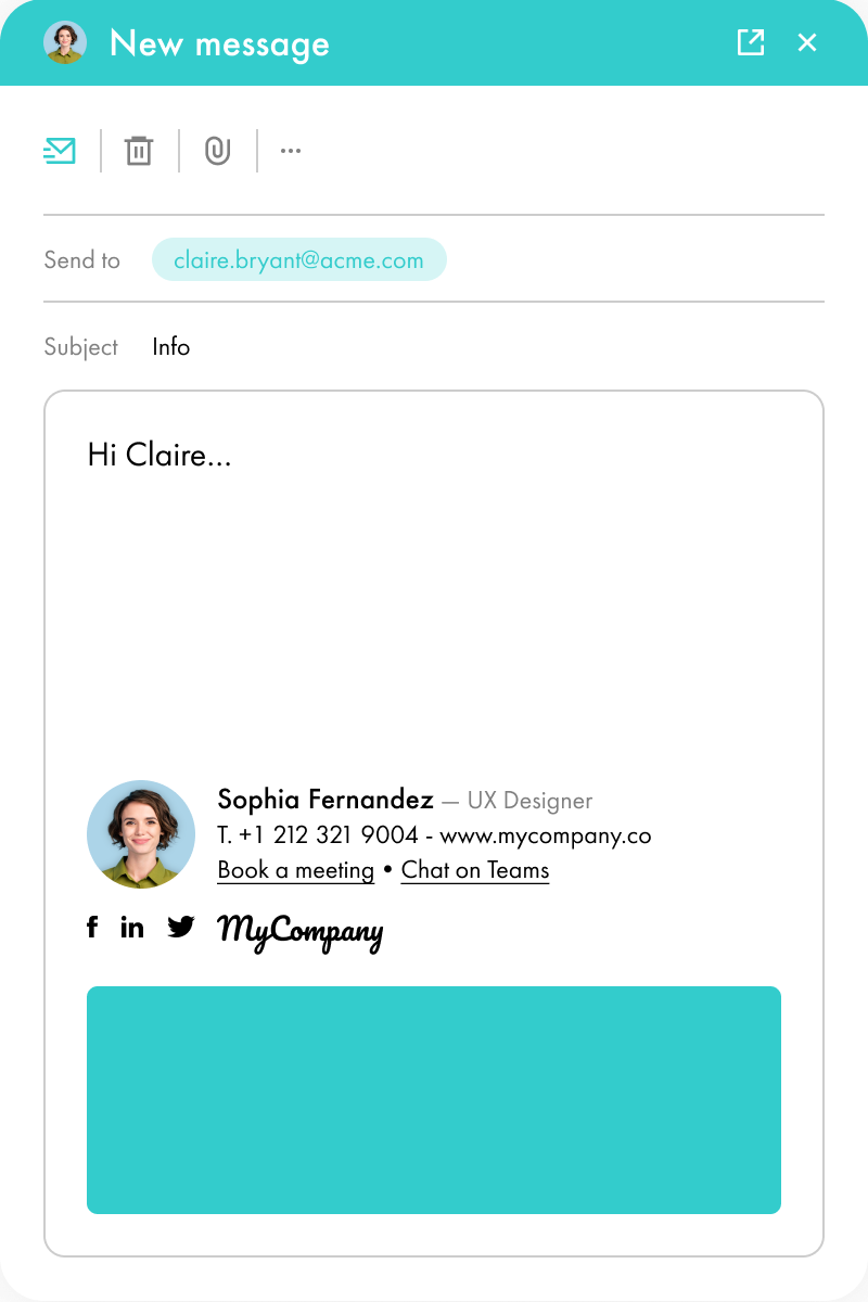
With Letsignit, you can easily add social network icons in your collaborators' email signatures and link to your company pages. Also, our "attributes" feature allows you to manage personalized URLs for each of your collaborators such as their individual LinkedIn profile.
And that's not all: you can add links to an appointment-setting application, allow your customers to leave reviews easily, and integrate our 'Chat on Teams' widget to let anyone start a discussion via Microsoft Teams chat.
It’s up to you! As an administrator of the Letsignit platform, you choose whether or not to grant modification rights to your employees. These permissions are managed on an attribute-by-attribute basis, which means that you can decide to allow the employee to change their phone number, but not the address of your premises, for example.
This feature applies to all attributes in your directory, including custom attributes created on Letsignit. When your employees change one or more attributes, your directory is obviously not affected.
It often happens that employees make their email signature their own: custom format, bad fonts, colors inconsistent with the brand standards... all of this has an impact on your brand!
A consistent visual identity is considered authentic and outperforms a perceived weak one by 20%. And, your customers are 2.4 times more likely to buy your products.
With Letsignit, take back control over your brand identity by standardizing all your email signatures. Our tool has many features that allow you to customize your signatures by department, by audience or by subsidiary. Not to mention the possibility of carrying out campaigns within your email signatures thanks to our Campaign offer.
What is the user experience like for our employees?
In both cases:
In short, they have autonomy in their email signature, but you keep control on the field, signatures, and banners they can edit or use.
With our "multi-signature" feature, your employees can benefit from multiple email signatures. No technical manipulation is required. Thanks to our Add-in for Outlook or the desktop app, they can change their email signatures as they wish with just a few clicks.
Regarding the creation of email signatures, you can make several variations such as:
Everything has been thought of to go further in the personalization process based on the recipient of your emails.
If sending emails has an impact, non-optimized email signatures also have an impact. An unsuitable format or an image that is too heavy considerably increases the size of your signatures... and therefore, your emails.
As a responsible economic actor, we contribute to reducing our CO2 emissions and those of our customers in several ways:
As we are increasingly involved in sustainability initiatives, our priority in 2023 is to develop even more green IT functionality.
If sending emails has an impact, non-optimized email signatures also have an impact. An unsuitable format or an image that is too heavy considerably increases the size of your signatures... and therefore, your emails.
As a responsible economic actor, we contribute to reducing our CO2 emissions and those of our customers in several ways:
As we are increasingly involved in sustainability initiatives, our priority in 2023 is to develop even more green IT functionality.
Brand identity design is the process of translating a brand's strategy, personality, and values into a consistent visual and verbal identity. It typically includes elements such as the logo, colors, typography, imagery, graphic elements, and tone of voice.
The 5 P's are commonly defined as Purpose, Positioning, Personality, Promise, and Perception. Together, they help clarify what your brand stands for, how it differentiates itself, what it promises to customers, and how it aims to be perceived.
Start with your brand strategy: define your mission, values, positioning, personality, and target audience. Then develop your visual system — including your logo, color palette, typography, imagery, and graphic elements — and test it across different channels before documenting everything in brand guidelines.
Start by documenting every key element of your visual identity and defining clear rules for how each one should be used. Include logo variations and clear space, colors, typography, imagery, graphic elements, layouts, and examples of correct and incorrect usage. The goal is to give everyone working with your brand a simple, practical reference for staying consistent.


Lorem ipsum dolor sit amet, consectetur adipiscing elit, sed do eiusmod tempor incididunt ut labore et dolore magna aliqua. Ut enim ad minim veniam, quis nostrud exercitation ullamco laboris nisi ut aliquip ex ea commodo consequat. Duis aute irure dolor in reprehenderit in voluptate velit esse cillum dolore eu fugiat nulla pariatur.

.png)